

The arrow symbol in the Tafex logo represents the brand’s export-driven nature. It signifies forward movement, expansion into new markets, and the ambition for growth. At the same time, it reflects Tafex’s role as a guiding force for companies seeking consultancy services.
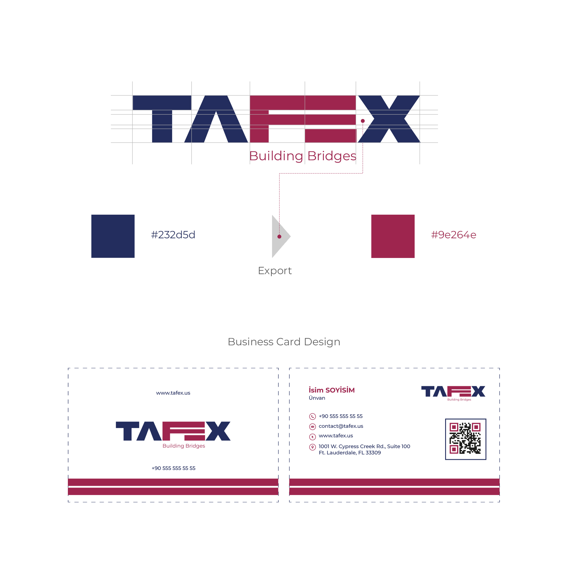
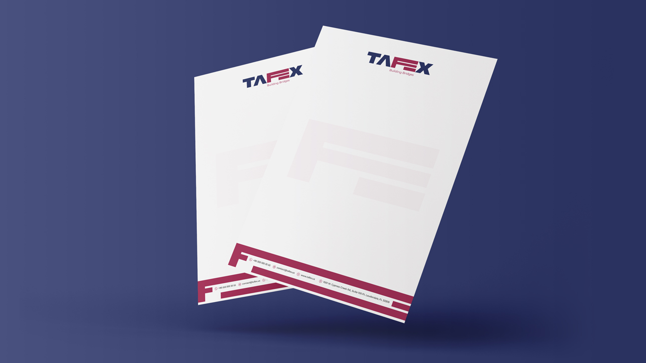
**The color palette chosen for the logo and corporate identity reflects trust, professionalism, and the vibrant energy of international trade.
- Shades of blue: Reliability, professionalism, and global trade
- Shades of gray: Corporate identity and timelessness
- Dynamic accent colors: Represent the brand’s energetic and ambitious spirit.**
In all elements of Tafex’s visual identity, we adopted a clean and strong communication style. From typography to iconography, every detail was crafted to strengthen the brand’s corporate image in the American market.